LEVEL DESIGN - GAMEPLAY DESIGN - EFFECTS DESIGN

LEVEL DESIGN - GAMEPLAY DESIGN - EFFECTS DESIGN

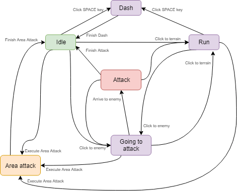
At the start of the project, I worked on the logic of the main character, Alita. Firstly, I decicded to design a State Machine with all the necesary actions, which I implemented later in C#.
The main actions that Alita can do that I implemented in the Vertical Slice are:
- Movement (Run)
- Normal melee attack
- Dash ability
- Area Attack ability
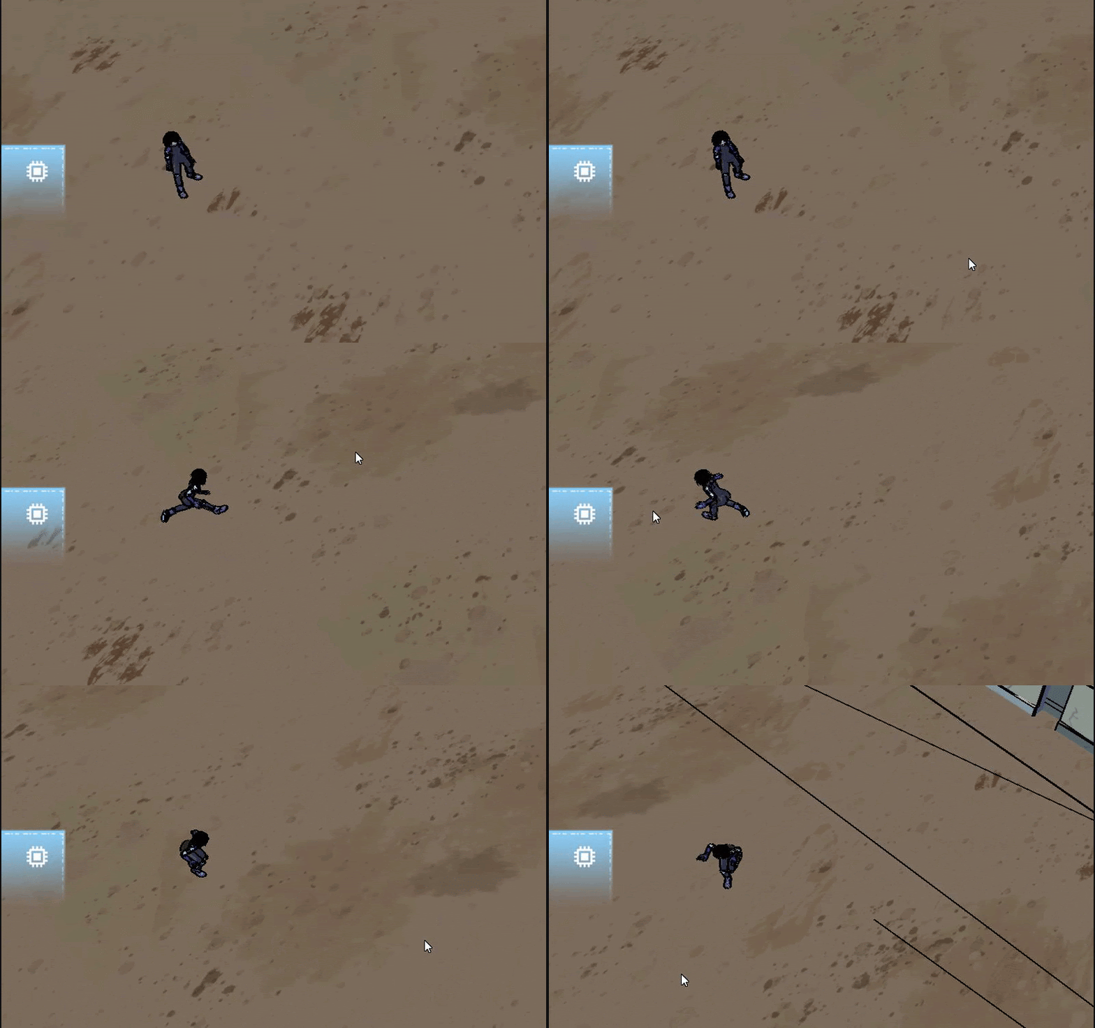
The movement of Alita, before the combat was reworked was firtsly implemented with Recast & Detour tools, made in engine by my teammate Guillem Costa.
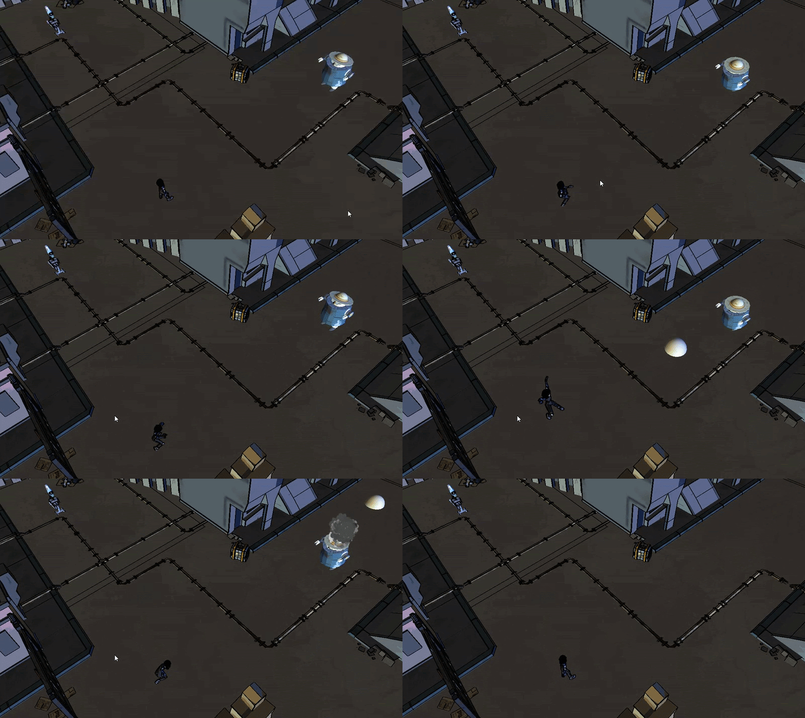
In the first vertical slice I made the design and first approximation of the first two of Alita's abilities: the Dash ability, that initially served as a means for mobility and the Area Attack, an attack that makes damage to every enemy arround Alita.
For the Alpha 1 vension of the game I designed and implemented the first approximation of what it is the third ability, the Burst Attack, which is a shooting attack that obliterates all the enemies that the plasma (in this case, the placeholder sphere) that Alita shoots touches.
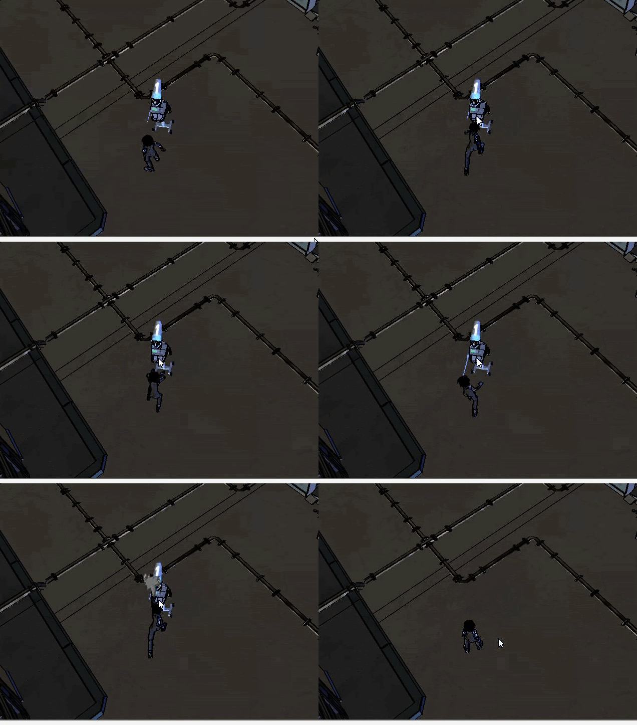
For the Alpha 1 version I also implemented a chain attack in which Alita makes three successive attacks, each one of them stronger than the latter.
For the second level of the game, after the city level; with my teammate Alfonso Sanchez-Cortés, we decided that it would be interesting that the second level would be something more organic compared to the city level, so we decided to make a sewers level, inspiring ourselves in the sewers of the Alita manga, where this sewers are some sort of abandoned underground city.
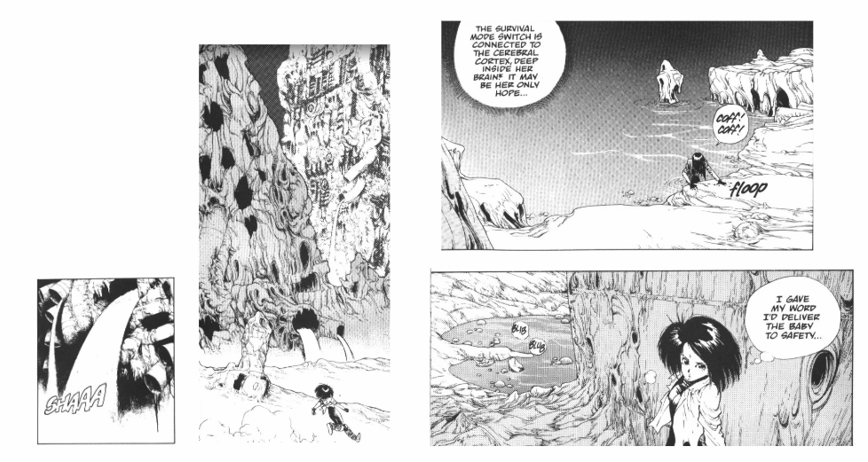
For the principal differential mechanic of the level, with Alfonso, we decided that firstly, we would add some verticality to the level because the ramp of the city level was an interesting feature that aded dynamism to the map and because playing with the Y axis in a videogame always leaves interesting results.
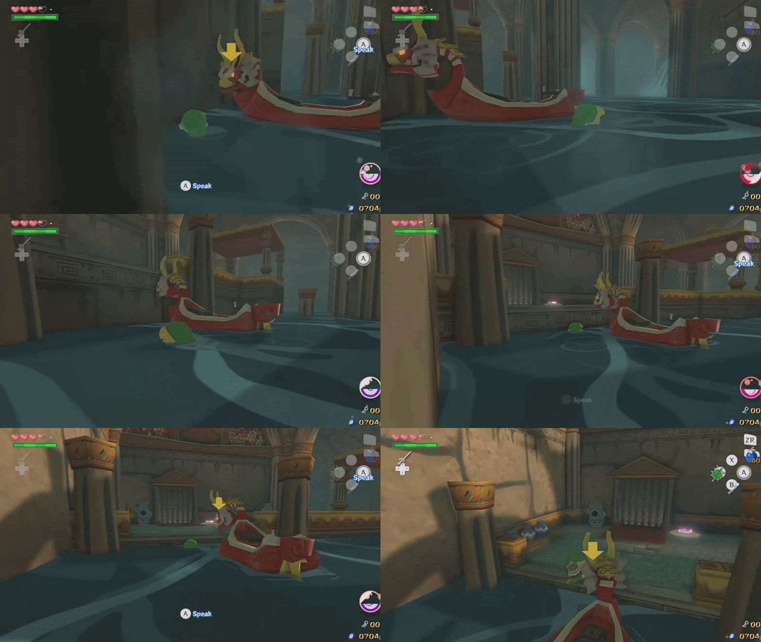
Looking at the manga reference for the sewers, and having decided to make a vertical level, we decided that the main differential mechanic would be lowering the water level of the stage in order to access new areas with 4 valves that the player has to find.
(Reference: The Legend of Zelda: The Wind Waker)
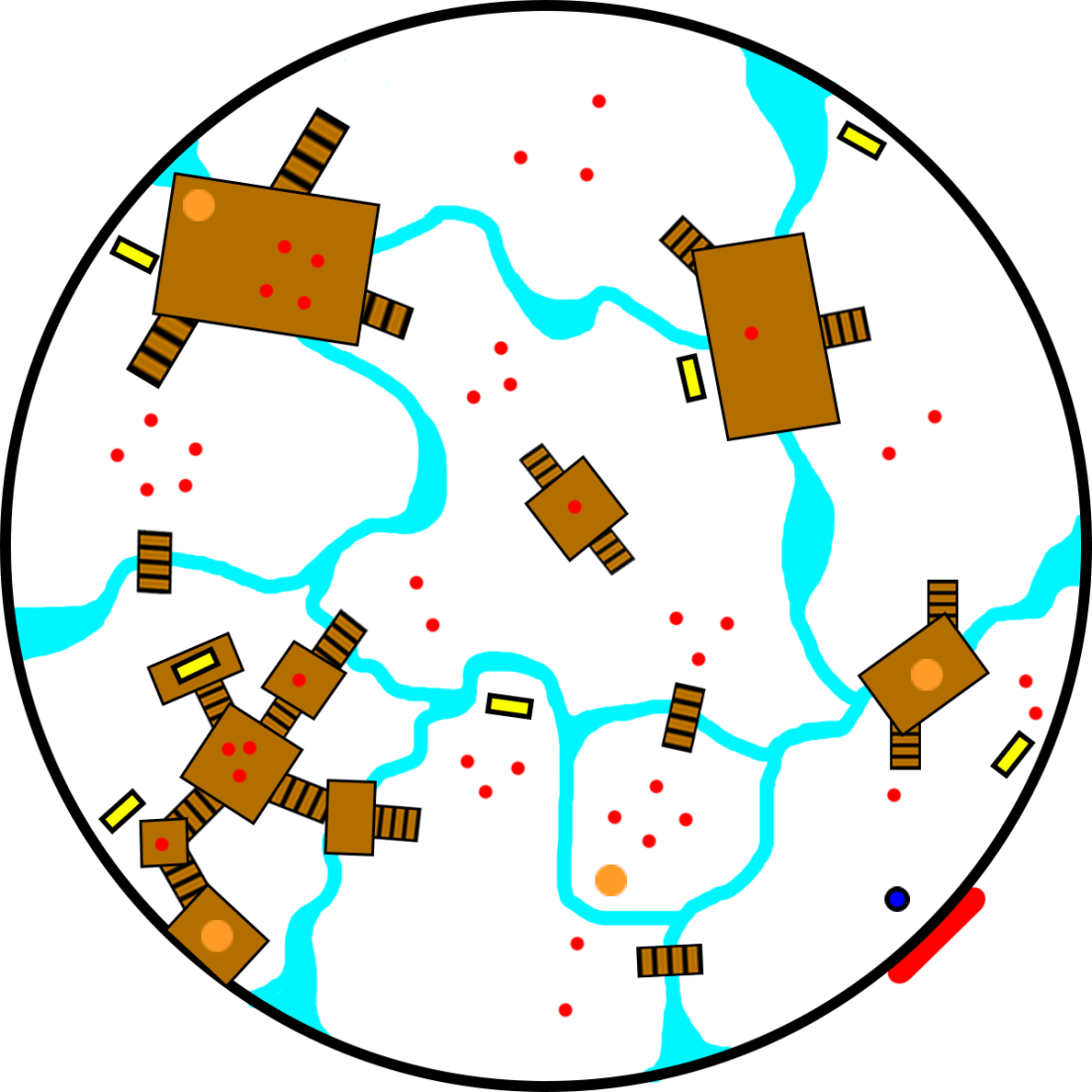
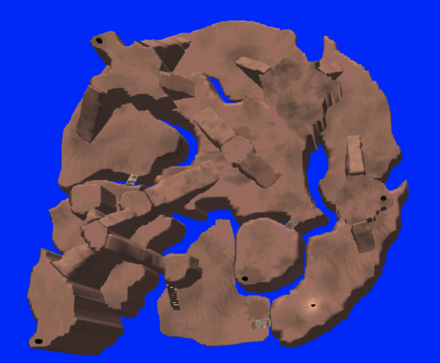
In the initial terrain design that I drawn in the conceptualization phase of the level, I divided the terrain in two height levels, where the brown blocks were the top floor, and the white ones were the bottom floor.
In the in-engine Mock Up that I made, this approach was followed to the letter, but later in the real iterations of the level, we decided to mantain the terrains positioning, but not maintaining them to the same height, in order for the water to have more space to lower between different terrain height levels.
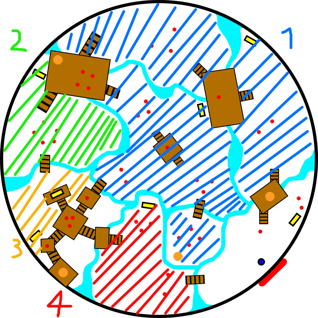
The level has suffered various iterations since it was firstly approached, and the way the terrains were covered has also changed during the project.
The final approach that I decided that it would best fit the level progression was to lower the terrains specified in this drawing this way; the first valve will lower the water so the (1) terrains can be accessed, the second valve will lower the water in a way the (2) terrains can be accessed and etc.
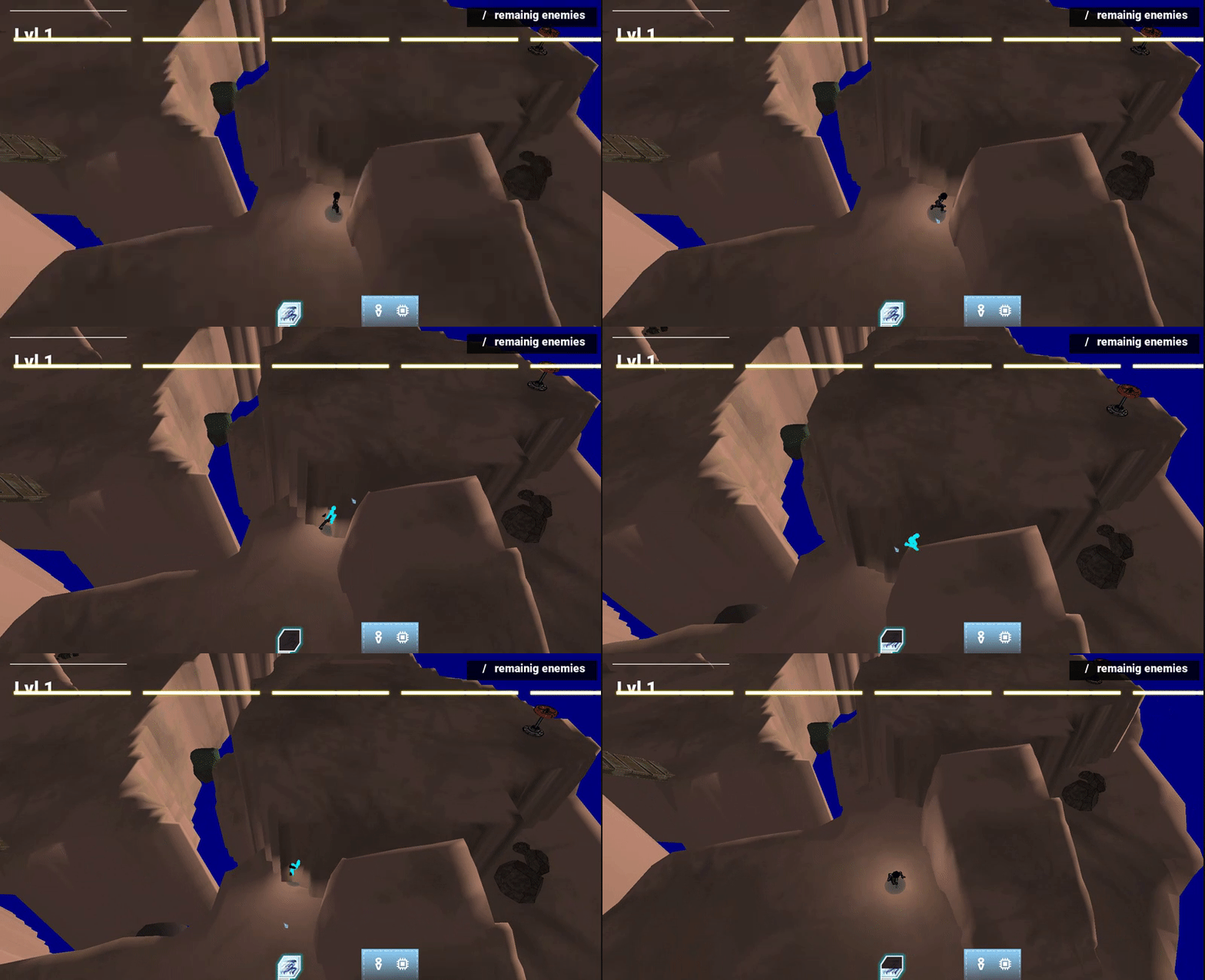
What we accomplished by making a Mock Up in JellyBit engine:
- Verified navigation through steep ramps was possible
- Determine what could had be done better for the level in terms of design
- Have a base for the level to be made
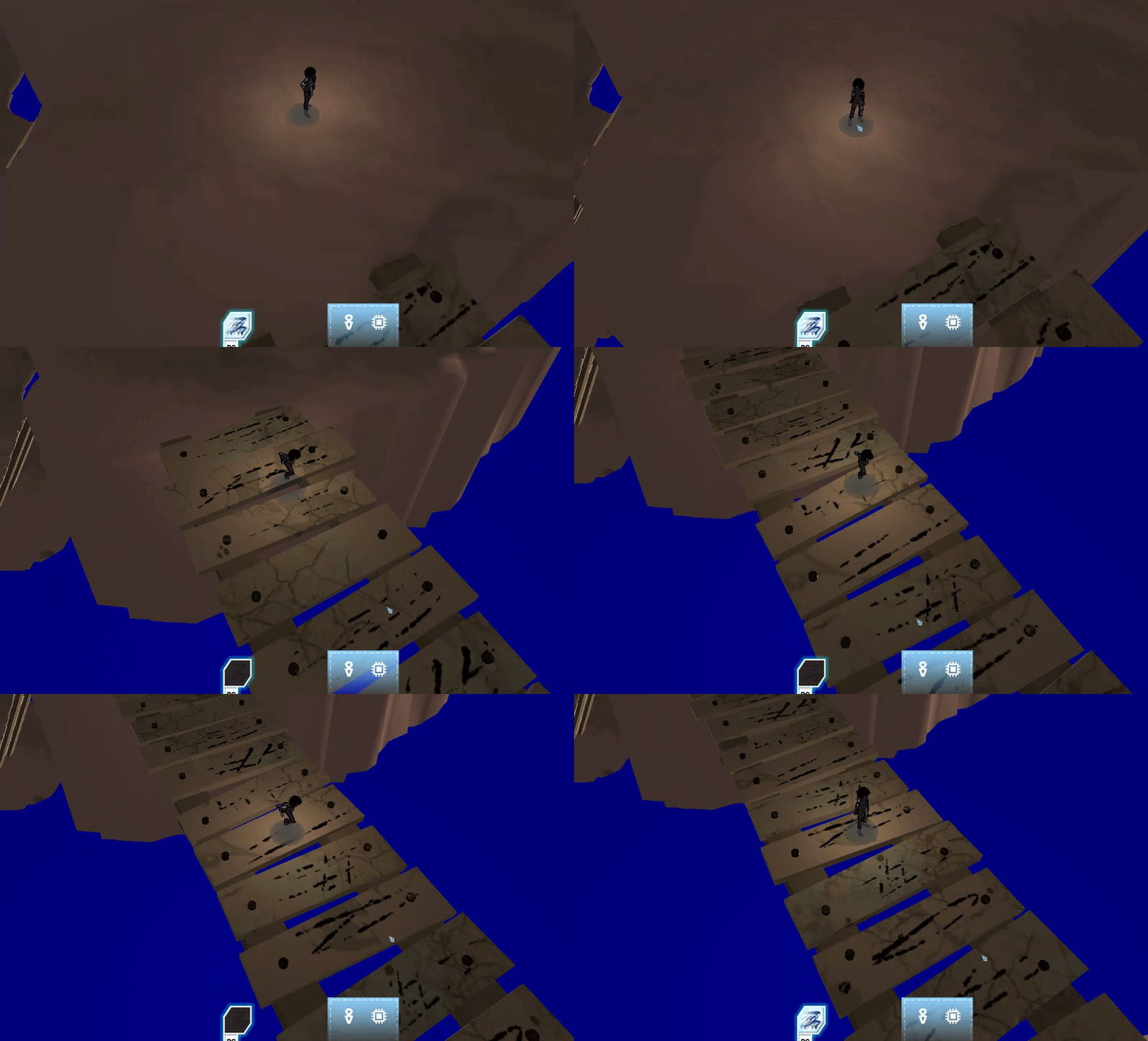
With the new steering behaviours system of the reworked combat system, dashing could put the player into the platforms of the level or out of the scenary.
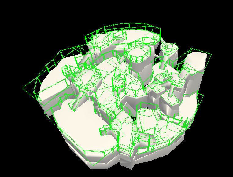
I put colliders through all the map to solve the issue. Later they haven't been necessary, after my teammate Sandra Alvarez improved the behaviours.
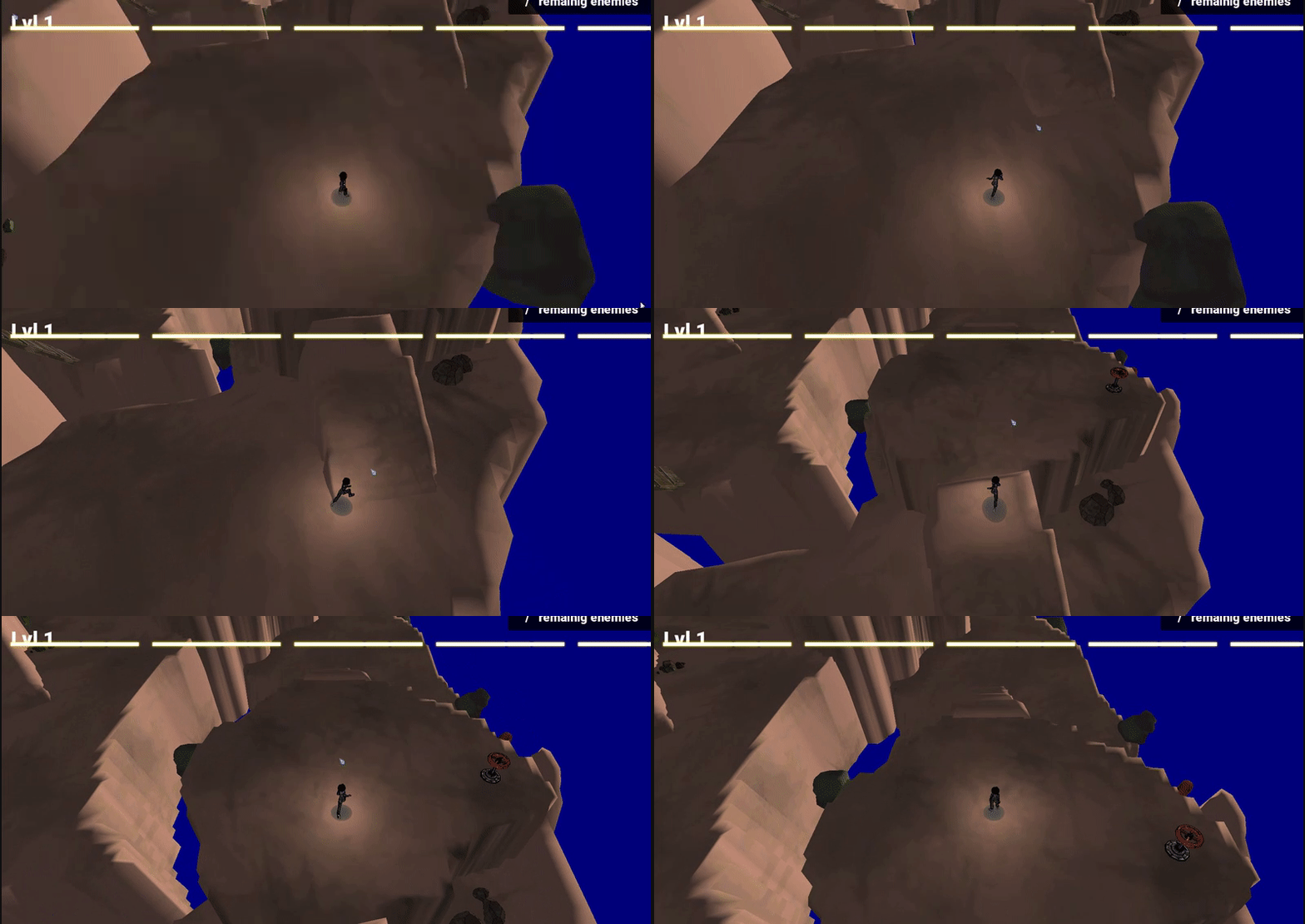
The terrain was too rough for Alita to walk on, so she would stay stuck in place when walking.
Flatten the terrains in Unity, and later make individual meshes with maya, done by my teammate Victor Masó.
The players (testers) had a hard time orientating themselves through the level.
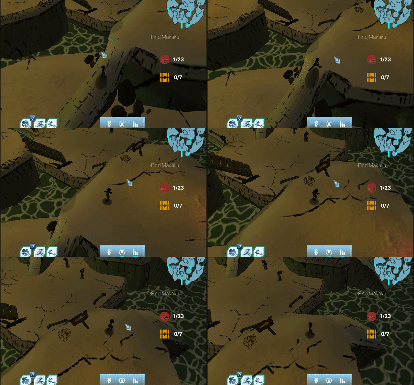
Rotate the camera in order to see well all the ramps and indicate the player the route in certain strategic parts, with sign props.
The level for the boss was in the scene of the Sewer Level initially.
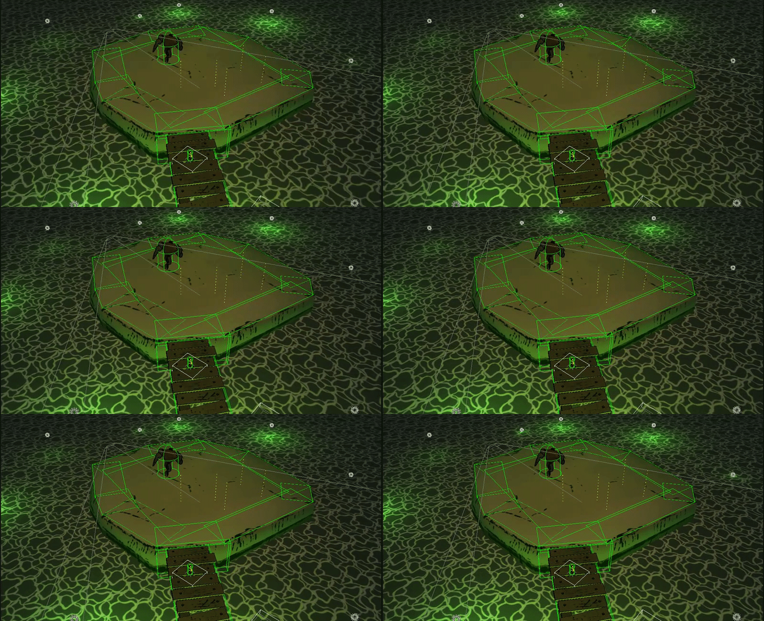
We decided to put it in another scene to prevent performance issues and that the boss didn't get to the Sewers Level.
- Narrative and dialog design
- Prop design
- Illumination design
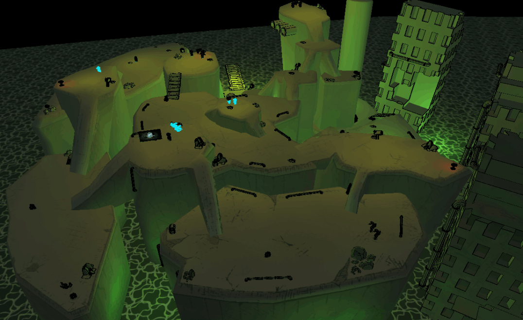
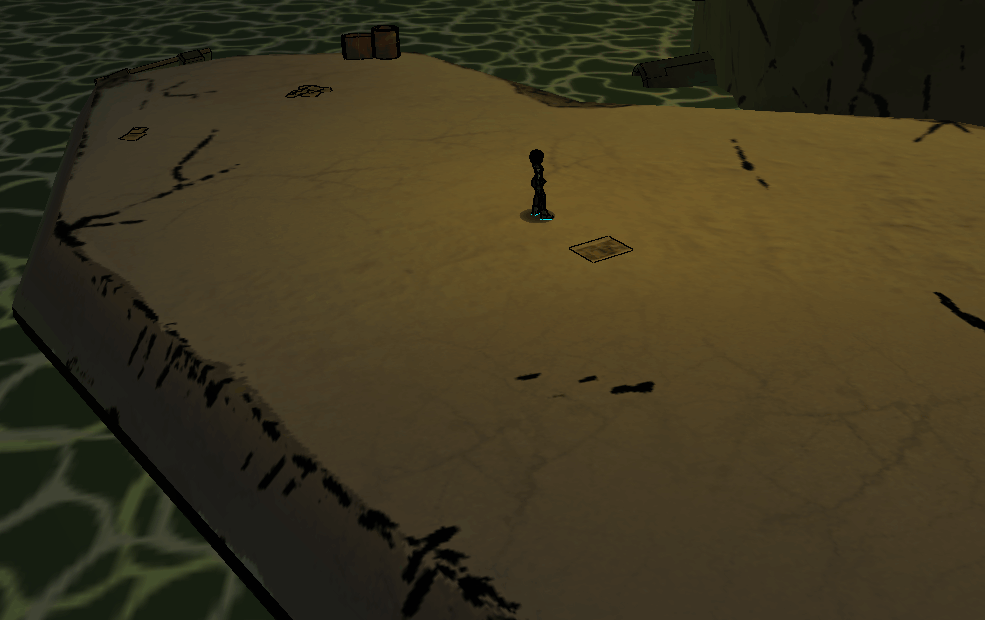
For the level illumination, the approach I took was to place point lights up and down the level. The upper lights are faint orange lights that are supposed to come from the surface above and the lower lights are green lights to make ambience when the player goes down through the level.
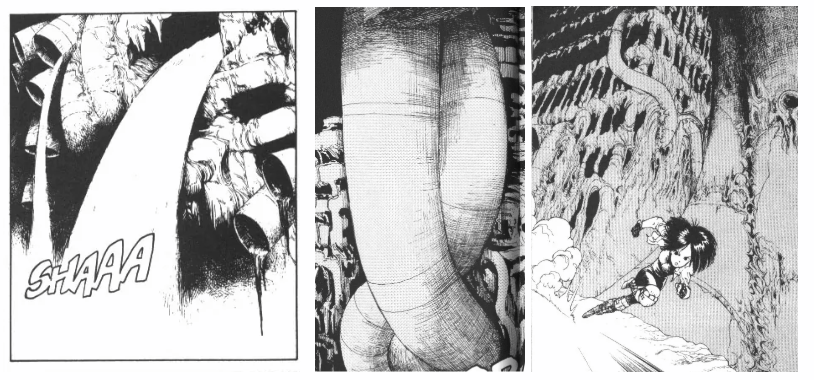
Some references of the manga that were used for the creation of the sewers level props.